Magentik
Links | magentik.comMagentik is a young social media agency, they needed a website and branding, we do websites and branding, it was a perfect match.
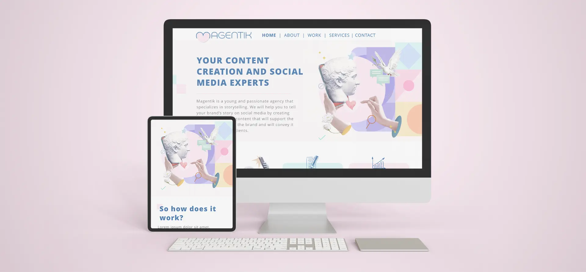
Magentik is a young social media agency, they needed a website and branding, we do websites and branding, it was a perfect match.
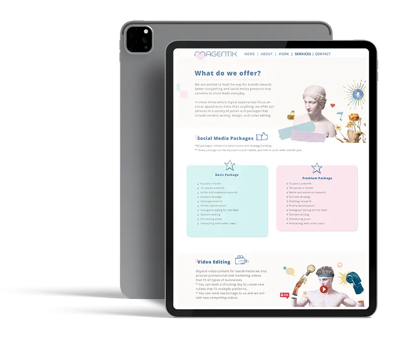
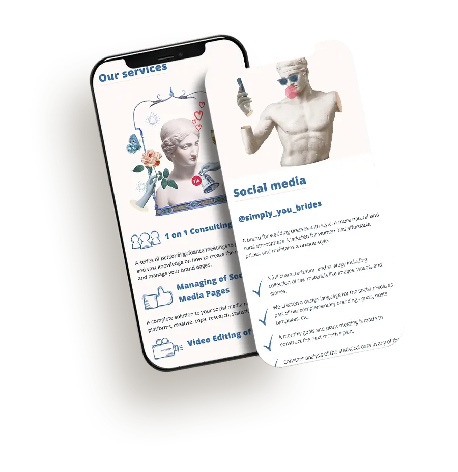
The goal was to create a design language that won't fall to the 'same old' category. Meaning that it should be visually attractive and organized sensibly.

We went on a wild journey to create a fresh and bold branding style that expresses strong contrast (antiques vs modern, round vs squared), but using beautiful soothing colors and humor to give the extra kick.

We fell in love with the color scheme during this project. The variety it allows is really surprising, and it is still easy on the eyes.


Another important aspect that was important to accomplish is that the website talks two languages, each with different writing direction, hence some elements (e.g images) are mirrored when changing the language